Creating A Theme
- Simone Tomwing

- Apr 23, 2019
- 3 min read

Creating a theme seems to be all the rage these days. Especially on Instagram where you can experiment with your "Highlights" section and persons are colour-coordinating their feeds.
Why do it?
Reinforce your brand personality. As soon as persons land on your profile, without even going into each individual post, they are able to get a sense of what your brand is about by just one look at your profile page. If you are a small brand who does not have a website and depends heavily on social media (especially Instagram) for your marketing, this is one way to maximize its potential.
It helps to focus your content. As the content creator, it forces you to think about the bigger picture and it creates a filter by which you can eliminate the clutter. By having a theme, you can swiftly decide whether or not a certain piece of content fits the brand aesthetic you have set for yourself.
It looks more professional. Think about it, when you see a well organized theme it immediately communicates to your audience a level of organization. It communicates that your branding is well thought out and suggests a level of professionalism your competitors might not have. Done well, it will attract the right partners and the right clients. Potential partners for your brand will be more willing to collaborate when they do not have to do too much digging to see whether or not your brand would be a good fit with their own.
What are some of the easiest ways to create a theme?
There are numerous examples. What works for one will not work for all. Find what fits your brand and more importantly what is most convenient for you. If you think creating a patterned grid is too much, perhaps you would like to stick with a colour or content theme instead. Below are a just a few examples I have worked on.
1. The Step & repeat
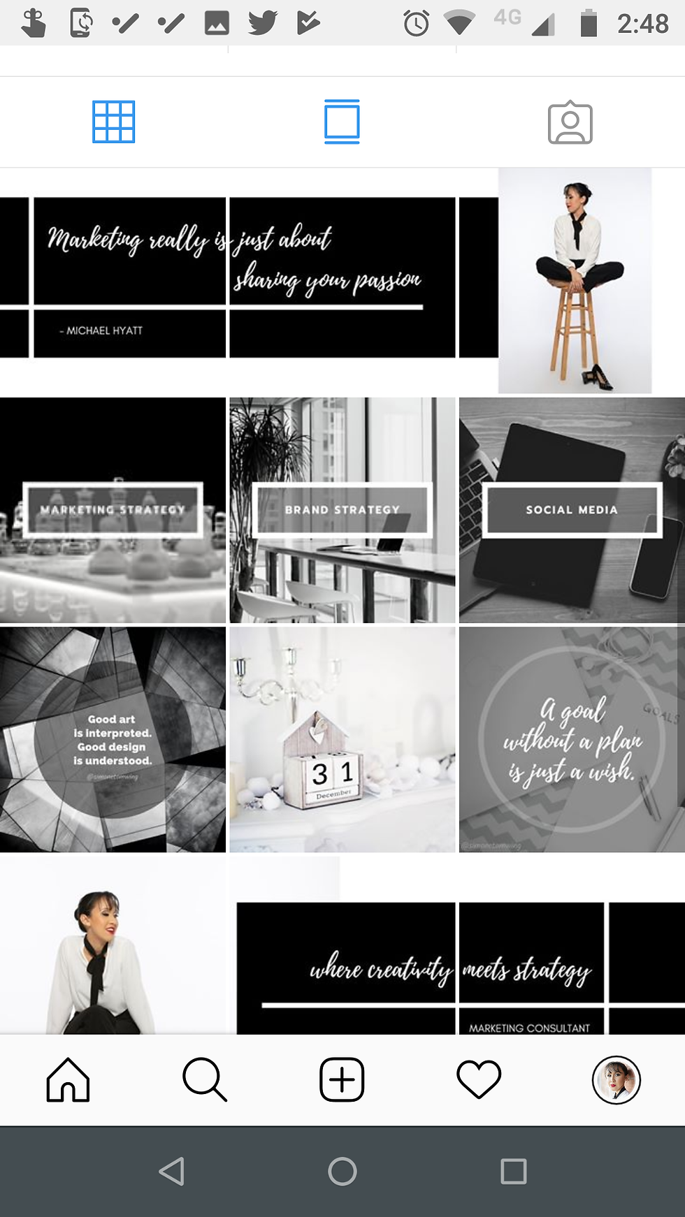
This is alternating between visuals and quotes. I find it is a nice way to stretch out the use of your photos and video content and it allows you to tell a story as someone lands on your profile. Without going into each individual post, viewers can immediately get a sense of your brand as the quote posts can act as captions for the photos around them.
2. The Colour
You have probably carefully selected your brand colours when you had your logo designed. You know what these colours mean to you and to your brand. Now to put them into action.
You can choose 1 or 2 colours. As I have done with my own black & white theme:

OR multiple colours as this client chose to do to match his new packaging.:

3. The content
The theme may also be in the content itself. If you are an artist or photographer, for example, your art and photography is your theme. Here is an example with a ballet company, which uses photography of their dancers as their primary content:
Creating a theme may not be for everyone. Honestly, I did not think it would even be for me at first. Only as time went by, I grew to enjoy pushing my creativity to come up with a cohesive look and it is one of the things people who see my page compliment me on all the time. It is certainly one of those things you need to plan ahead, but as you can see for yourself, the impression it makes may well be worth the effort.
Think you need some help coming up with your own content plan? Get in touch. This is where creativity meets strategy for your business marketing solutions.


Kommentare